Urban Signage - The Good, The Bad and The fugly!

Anything goes here.. :) Now with Beer Garden for our smoking patrons.
Message
Author
User avatar
wilkiebarkid
Donating Member
Donating Member
Posts: 601
Joined: Thu Jan 17, 2008 9:19 am
Location: Adelaide

Urban Signage - The Good, The Bad and The fugly!

#1 Post by wilkiebarkid » Sun Jul 13, 2008 9:50 pm

This thread is dedicated to urban signage.

Signs of all types are an integral part of the urban landscape, providing valuable information on products and services both public and private. At the same time the plethora of signage in an urban landscape can either enhance the visual experience of a city if done right, or clutter, or congest the appearance as in many Asian cities.

Adelaide could benefit from a vast improvement in the quality of its signage. Sometimes signs are considered visual pollution, but if a high standard of signage is promoted by the landowners, councils etc., it will improve the look of the city.

Many major suburban shopping centres require their tenants to upgrade their signage every few years to an expected high quality standard. The CBD should be no different, yet there are so many very basic signs.

Let's have a look at Adelaide and acknowledge the good, the bad and the fugly!!


Pretty basic and....well f..kin' shit!
Image


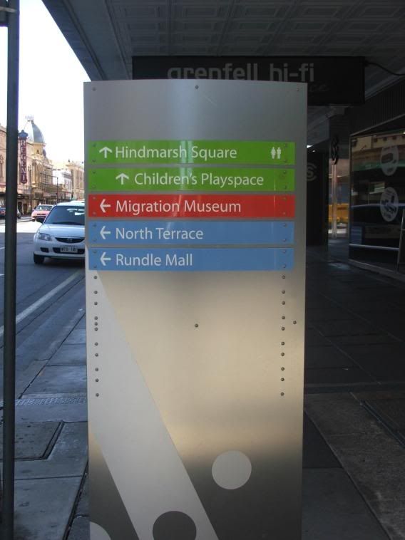
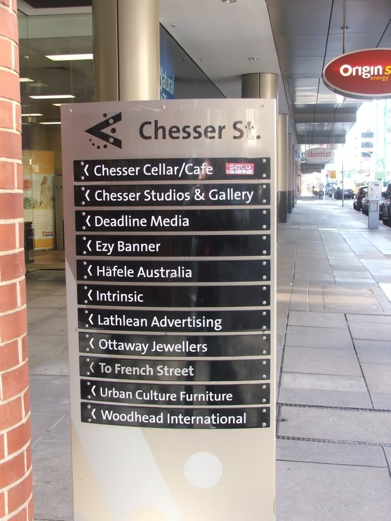
These signs are bloody terrific....well done to the ACC.
Image

Image

Image


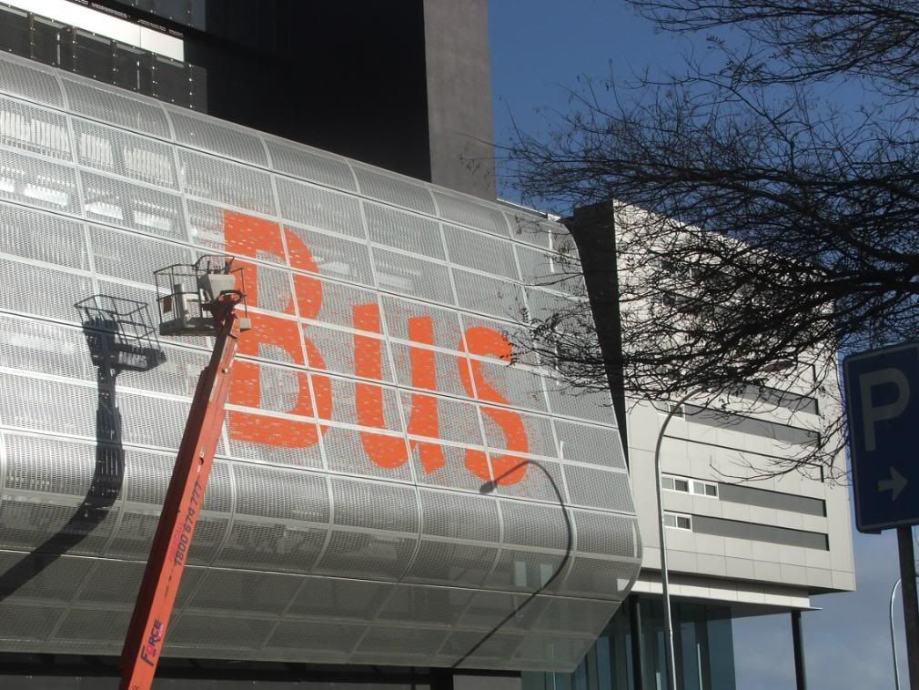
I think the Bus Station signage is OK


Image


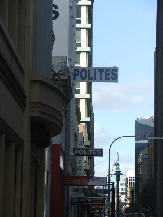
Unfortunately, the Polites Group have produced some of the most cheap signage in this city. A city they owe more to!!

Image


The bus stop signage looks informative and modern

Image


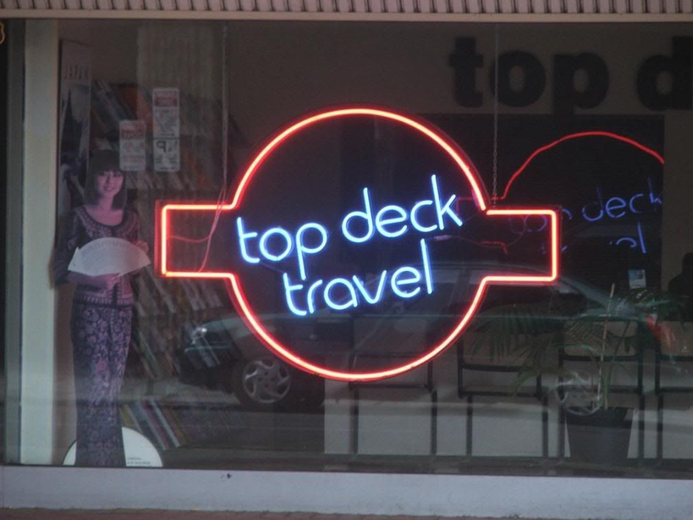
Great neon signage illuminated 24 hours a day.

Image


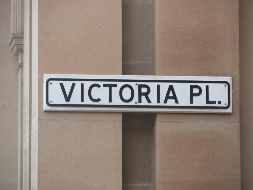
Basic street signage........perhaps needs a classier look.

Image


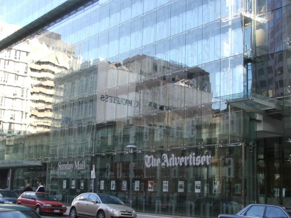
The new Advertiser building. One of the best examples of modern classy signage.

Image

urban
Legendary Member!
Posts: 607
Joined: Thu Apr 12, 2007 10:59 am
Location: City of Unley

Re: Urban Signage - The Good, The Bad and The fugly!

#2 Post by urban » Sun Jul 13, 2008 10:32 pm

In that last photo the omnipresence of the bloody polites signs is evident

User avatar
Xaragmata
Super Size Scraper Poster!
Posts: 1613
Joined: Thu Jul 19, 2007 2:08 pm
Location: Adelaide / West
Contact:

Re: Urban Signage - The Good, The Bad and The fugly!

#3 Post by Xaragmata » Sun Jul 13, 2008 10:48 pm

wilkiebarkid wrote:This thread is dedicated to urban signage.

These signs are bloody terrific....well done to the ACC.
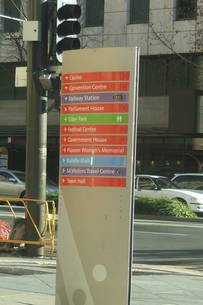
I'm sure I saw at least one of these at Mawson Lakes Central recently, and yes, they are modern & informative.

crawf
Donating Member
Donating Member
Posts: 5523
Joined: Thu Feb 16, 2006 7:49 pm
Location: Adelaide

Re: Urban Signage - The Good, The Bad and The fugly!

#4 Post by crawf » Mon Jul 14, 2008 12:17 am

That Bus station signage looks terrible

That development has been such a huge disappointment.

crawf
Donating Member
Donating Member
Posts: 5523
Joined: Thu Feb 16, 2006 7:49 pm
Location: Adelaide

Re: Urban Signage - The Good, The Bad and The fugly!

#5 Post by crawf » Mon Jul 14, 2008 12:21 am

wilkiebarkid wrote:T

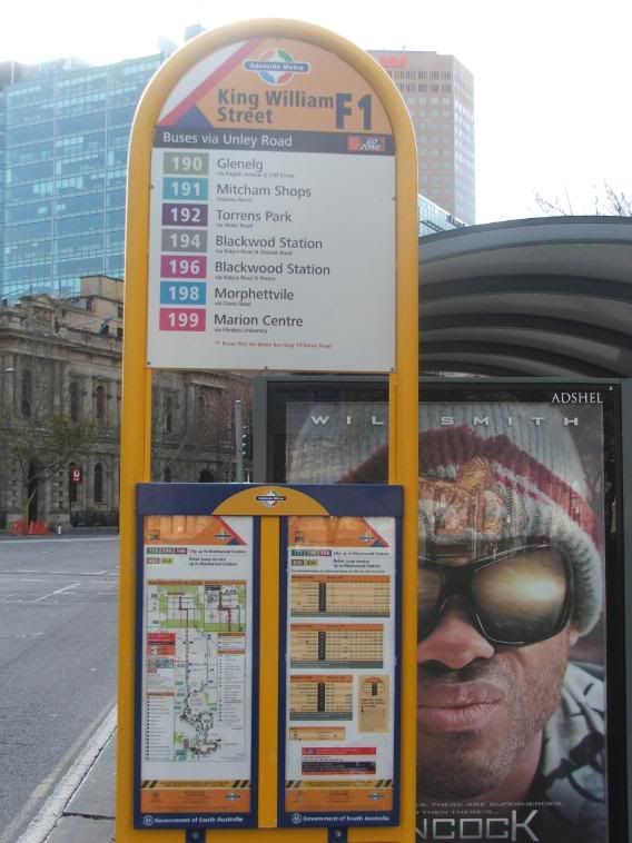
The bus stop signage looks informative and modern
Image
Lol they spelt 'Blackwood' wrong.

User avatar
SRW
Donating Member
Donating Member
Posts: 3559
Joined: Fri Jun 08, 2007 9:42 pm
Location: Glenelg

Re: Urban Signage - The Good, The Bad and The fugly!

#6 Post by SRW » Mon Jul 14, 2008 12:23 am

Entirely agree with you barkid.

It's one of the things that I am most envious of in certain other cities of the world. The level of careful thought that goes into even the most basic urban industrial design is something I desperately wish to be fostered in Adelaide. Hell, in Stockholm, even the permanent speed cameras are so well-designed (from an aesthetic viewpoint) that I actually don't mind driving with them around everywhere!

The problem we have in the city centre is that there's a lack of coherency, with successive councils introducing new design standards without due regard for past and future implementations. This planning-in-isolation needs to give way to a long-term set of design principles that should inform all aspects of signage, street furnishing and the like.

Another area which I would like to improve is Adelaide Metro. It's a good brand (the livery and logo, for example) but it could be so much better; I actually don't like the present signage, and the recent efforts at Oaklands are mediocre at best (the colours are poorly considered, and what chance is there that it will fit into a system-wide standard?). BVG, SL and even Metlink to an extent are examples of brands (and providers) which have fully thought-out and sophisticated design standards.
Keep Adelaide Weird

crawf
Donating Member
Donating Member
Posts: 5523
Joined: Thu Feb 16, 2006 7:49 pm
Location: Adelaide

Re: Urban Signage - The Good, The Bad and The fugly!

#7 Post by crawf » Mon Jul 14, 2008 12:45 am

One thing I would like to see is the street signs in the Adelaide city council and the train station signs replaced with modern and attractive signs.

I hate the current train station signs, even the so called new ones.
Last edited by crawf on Mon Jul 14, 2008 12:53 am, edited 1 time in total.

User avatar
Omicron
Super Size Scraper Poster!
Posts: 2336
Joined: Mon Oct 15, 2007 2:46 pm

Re: Urban Signage - The Good, The Bad and The fugly!

#8 Post by Omicron » Mon Jul 14, 2008 12:47 am

Careful now, or I'll turn this into an 'Omi Pours Scorn Upon Misspelled Signage' thread, in which I bleat about the inept spelling and grammar skills of the wider population.

We don't want to have to put up with that. :mrgreen:

User avatar
Norman
Donating Member
Donating Member
Posts: 6391
Joined: Sun Mar 25, 2007 1:06 pm

Re: Urban Signage - The Good, The Bad and The fugly!

#9 Post by Norman » Mon Jul 14, 2008 2:41 am

I actually do like the new Bus Timetable Holders, but not the ones out in the suburbs. Also, Stop 11 Marion Road, which is like the one in the city, still shows bus routes removed over almost 2 years ago.

User avatar
skyliner
Super Size Scraper Poster!
Posts: 2359
Joined: Tue Oct 24, 2006 9:16 pm
Location: fassifern (near Brisbane)

Re: Urban Signage - The Good, The Bad and The fugly!

#10 Post by skyliner » Mon Jul 14, 2008 9:07 am

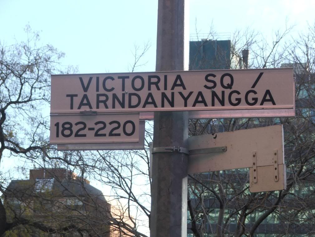
Can anyone enlighten me as to where Vic Sq/Tarndanya sign came from? (don't say a factory!) Why change the name? Is it political correctness in recognition of aborigines - like the case of some town names? (But often little else about aboriginals is recognised when you get to live there in these towns - Eg Pub for the 'whites' only, pub for the 'blacks' only or be shot as once happened in Moree 1981 in NSW).

I prefer Vic Sq.- a grand ring to it!

And on signs, Adelaide is a lot better off concerning visual pollution with such than the eastern cities. .I recall around 2000 how even the large green road signs were not even in Adelaide at all - caused some dismay in navigating certain parts of the burbs when not familiar at the time. I appreciate them but they can become overpowering if heaps are together.

Bris now has large long rectangular black signs over the roads with messages to the general public - such as 'save our water'. They look and operate very similarly to the bus destination signs on the front of buses in Adelaide. They keep changing and are a saftey menace as well because you try to read the entire stage by stage message as it wont fit on all at once. These big ugly things, , with safety issue as well, would have to be far worse than any in Adelaide. Count your blessings guys. They'll show up one day. Look foward to it!

ADELAIDE - CITY ON THE MOVE
Jack.

Will
VIP Member
VIP Member
Posts: 5798
Joined: Fri Sep 16, 2005 6:48 pm
Location: Adelaide

Re: Urban Signage - The Good, The Bad and The fugly!

#11 Post by Will » Mon Jul 14, 2008 10:28 am

skyliner wrote:Can anyone enlighten me as to where Vic Sq/Tarndanya sign came from? (don't say a factory!) Why change the name? Is it political correctness in recognition of aborigines - like the case of some town names? (But often little else about aboriginals is recognised when you get to live there in these towns - Eg Pub for the 'whites' only, pub for the 'blacks' only or be shot as once happened in Moree 1981 in NSW).

I prefer Vic Sq.- a grand ring to it!


ADELAIDE - CITY ON THE MOVE
I too prefer Victoria Square. Changing its name to Tarndanyyangga is political correctness gone mad. Specially when you consider that Victoria Square is a 'European' creation. Before colonisation, the area taken up by Victoria Square was just a ubiquitous patch of scrub.

User avatar
Mants
Legendary Member!
Posts: 990
Joined: Sun Nov 06, 2005 12:40 am
Location: City of Burnside

Re: Urban Signage - The Good, The Bad and The fugly!

#12 Post by Mants » Mon Jul 14, 2008 11:19 am

Will wrote:
skyliner wrote:Can anyone enlighten me as to where Vic Sq/Tarndanya sign came from? (don't say a factory!) Why change the name? Is it political correctness in recognition of aborigines - like the case of some town names? (But often little else about aboriginals is recognised when you get to live there in these towns - Eg Pub for the 'whites' only, pub for the 'blacks' only or be shot as once happened in Moree 1981 in NSW).

I prefer Vic Sq.- a grand ring to it!


ADELAIDE - CITY ON THE MOVE
I too prefer Victoria Square. Changing its name to Tarndanyyangga is political correctness gone mad. Specially when you consider that Victoria Square is a 'European' creation. Before colonisation, the area taken up by Victoria Square was just a ubiquitous patch of scrub.
i cant even attempt to pronounce that. what on earth would the tourists think!?

crawf
Donating Member
Donating Member
Posts: 5523
Joined: Thu Feb 16, 2006 7:49 pm
Location: Adelaide

Re: Urban Signage - The Good, The Bad and The fugly!

#13 Post by crawf » Mon Jul 14, 2008 12:13 pm

Will wrote:
skyliner wrote:Can anyone enlighten me as to where Vic Sq/Tarndanya sign came from? (don't say a factory!) Why change the name? Is it political correctness in recognition of aborigines - like the case of some town names? (But often little else about aboriginals is recognised when you get to live there in these towns - Eg Pub for the 'whites' only, pub for the 'blacks' only or be shot as once happened in Moree 1981 in NSW).

I prefer Vic Sq.- a grand ring to it!


ADELAIDE - CITY ON THE MOVE
I too prefer Victoria Square. Changing its name to Tarndanyyangga is political correctness gone mad. Specially when you consider that Victoria Square is a 'European' creation. Before colonisation, the area taken up by Victoria Square was just a ubiquitous patch of scrub.
It annoys me everytime I see that, same with Victoria Park.

User avatar
Matt
Legendary Member!
Posts: 1125
Joined: Wed Feb 07, 2007 12:36 pm
Location: London

Re: Urban Signage - The Good, The Bad and The fugly!

#14 Post by Matt » Mon Jul 14, 2008 1:05 pm

Those Victoria Square signs are awful, aren't they..
So cheap looking.

The ugly 80's black and white signage around the city has to go

User avatar
wilkiebarkid
Donating Member
Donating Member
Posts: 601
Joined: Thu Jan 17, 2008 9:19 am
Location: Adelaide

Re: Urban Signage - The Good, The Bad and The fugly!

#15 Post by wilkiebarkid » Mon Jul 14, 2008 1:26 pm

This one falls into the FUGLY category.

Image


I think a uniform signage, livery etc should apply to all metro transport systems. Something a little more sophisticated than this.

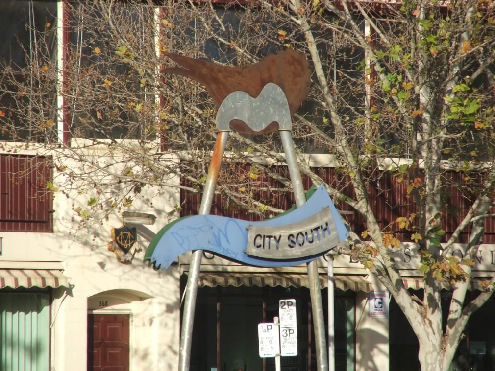
This sign looks like it belongs in the Spongebob Squarepants area of Dreamworld!

Post Reply

Who is online

Users browsing this forum: No registered users and 22 guests