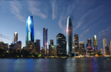
[APP] 199-200 North Terrace | 85m | 20lvls | Mixed Use
[APP] Re: #PRO: 199-200 North Tce | 53m | 18lvls | Student
No architectural merit in the old building, I would like others have liked to see a bigger development retaining the fronts of the surrounding buildings. 

[APP] Re: #PRO: 199-200 North Tce | 53m | 18lvls | Student
i think when sgradidge mentions character, he means the internal character of the place, including the music, people, and his personal memories - right sgradidge?
Opportunity is missed by most people because it is dressed in overalls and looks like work.
-
how_good_is_he
- High Rise Poster!
- Posts: 238
- Joined: Sat Feb 04, 2006 9:32 pm
[APP] Re: #PRO: 199-200 North Tce | 53m | 18lvls | Student
New renders of 2 different options submitted. Comments from council planners is they are against the wall of glass on North Tce facade in option 1 and the curved element in option 2. Reason given, they want to minimise bulk/density/impact on North Tce facade. Comments? Your preferred option? Should the developer re-lodge it with the DAC instead?


[APP] Re: #PRO: 199-200 North Tce | 53m | 18lvls | Student
To be honest, I love them both! 
These are the kinds of buildings I love, they're also all over Spencer Street, but in apartment form.
These are the kinds of buildings I love, they're also all over Spencer Street, but in apartment form.
Last edited by Norman on Sun Aug 31, 2008 11:18 pm, edited 1 time in total.

[APP] Re: #PRO: 199-200 North Tce | 53m | 18lvls | Student
I am loving the curved render!
When will this go to the panel?
When will this go to the panel?
http://twitter.com//tarcobello
http://mrpianoman.com
'we've had some times i wouldn't trade for the world..'
Rise Against
http://mrpianoman.com
'we've had some times i wouldn't trade for the world..'
Rise Against
[APP] Re: #PRO: 199-200 North Tce | 53m | 18lvls | Student
Both are great. But definitely the second design.
Noticed the signage in the renders, "Promenade". Is this the name of the tower officially, or is it just eye candy for the renders?
Noticed the signage in the renders, "Promenade". Is this the name of the tower officially, or is it just eye candy for the renders?
[APP] Re: #PRO: 199-200 North Tce | 53m | 18lvls | Student
Got to agree, the first one is pretty good but damn that second one is bloody awsome. Need more of this kind of thing proposed for Adelaide. Definately one of my favourite proposals!!!
P.S. Certainly doesnt look like student apartments to me... Are we sure they are?, because to me it looks like million dollar apartments. But if they are student, then why cant all student apartments look like that?
P.S. Certainly doesnt look like student apartments to me... Are we sure they are?, because to me it looks like million dollar apartments. But if they are student, then why cant all student apartments look like that?
-
how_good_is_he
- High Rise Poster!
- Posts: 238
- Joined: Sat Feb 04, 2006 9:32 pm
[APP] Re: #PRO: 199-200 North Tce | 53m | 18lvls | Student
Problem is the council planners won't support either facades, saying option 1 with the wall of glass has too much bulk & density for North Tce and option 2 - the curved element, is too "out there" for North Tce, doesnt fit in with the streetscape and has too much impact.
Thats Adelaide City Council planners for you.
If you were the developer would you re-lodge it with the DAC and in-effect start all over again with many more tens of thousands re-spent in application fees, consultants etc. The architects have already spent over 6 months trying to convince council.
As for the name, for those who remember it in the late 80s, the building was originally called The Promenade, so a nice nostalgic touch.
Problem with apartments here is lack of avail. carparking as site is quite tight. Other option is to go with a 5-star hotel, but there is be a glut of these coming. Probably the first 5 star student accom. available for the international students.

[APP] Re: #PRO: 199-200 North Tce | 53m | 18lvls | Student
the second one is great, a fantastic addition to north terrace.
new buildings shouldn't just blend in, they should each make a statement.
compare this with the alpha/palais crap further down north terrace and i dont know why anyone is complaining.
new buildings shouldn't just blend in, they should each make a statement.
compare this with the alpha/palais crap further down north terrace and i dont know why anyone is complaining.
[APP] Re: #PRO: 199-200 North Tce | 53m | 18lvls | Student
They're both attractive designs but I have to concur with everyone else and chose design 2. We need eye-catching designs in our high-rise buildings.
The council's opposition to both designs is very saddening. Would the council rather another bland box be built instead? What a backwater mentallity!
I realize that it would incur greater costs to the developers, but if you want to have any chance of this being built, re-lodge the plans with the DAC. They may use the same instruments to judge developments, but I doubt the DAC would have the same village mentallity.
-
how_good_is_he
- High Rise Poster!
- Posts: 238
- Joined: Sat Feb 04, 2006 9:32 pm
[APP] Re: #PRO: 199-200 North Tce | 53m | 18lvls | Student
Exactly my thoughts! The council planners are basically saying don't rock the boat and keep the staus quo, even if the status quo is crap. So much for encouraging original and bold designs...
[APP] Re: #PRO: 199-200 North Tce | 53m | 18lvls | Student
Of course the council is bloody against both of the proposals  the boring old sods. I can't wait for all these pre existing development applications to go through so we dont have to hear about them anymore.
Back to the proposal at hand. The first one is gorgeous but damn that second one!!! I think besides the Currie St tower this would be the most futuristic design Adelaide has ever seen. Bring on more of these type of proposals! I will be very disappointed if this is rejected.
Just a question. Will this building be clearly visible in the skyline view from light's lookout? It will do wonders to break up the line of monotonous brown buildings near the myer centre if it is.
Last edited by Joely on Mon Sep 01, 2008 1:10 am, edited 1 time in total.

[APP] Re: #PRO: 199-200 North Tce | 53m | 18lvls | Student
Design #2 has caused a rumpus in my trousers.
There, I said it.
There, I said it.
-
cruel_world00
- Donating Member

- Posts: 786
- Joined: Fri Jun 22, 2007 11:54 am
[APP] Re: #PRO: 199-200 North Tce | 53m | 18lvls | Student
The first one is the kind of thing I would expect would be the dumbed down version of the second one... yet it is still awesome.
I do agree that the second is by far superior.
Hope it gets through.
I do agree that the second is by far superior.
Hope it gets through.
-
Düsseldorfer
- High Rise Poster!
- Posts: 288
- Joined: Sat Sep 15, 2007 3:52 am
[APP] Re: #PRO: 199-200 North Tce | 53m | 18lvls | Student
holy fk, i'm hoping that design 2 with the awesome curved front gets approved!!!!
wouldn't be surprised if the council only approved the first design tho, and say that the second 'curved' design (like with 20-22 currie st) would cause the sun to reflect onto the footpath and blind people
wouldn't be surprised if the council only approved the first design tho, and say that the second 'curved' design (like with 20-22 currie st) would cause the sun to reflect onto the footpath and blind people
Who is online
Users browsing this forum: Ahrefs [Bot], Amazon [Bot], dsriggs, Google [Bot] and 4 guests